Lilli
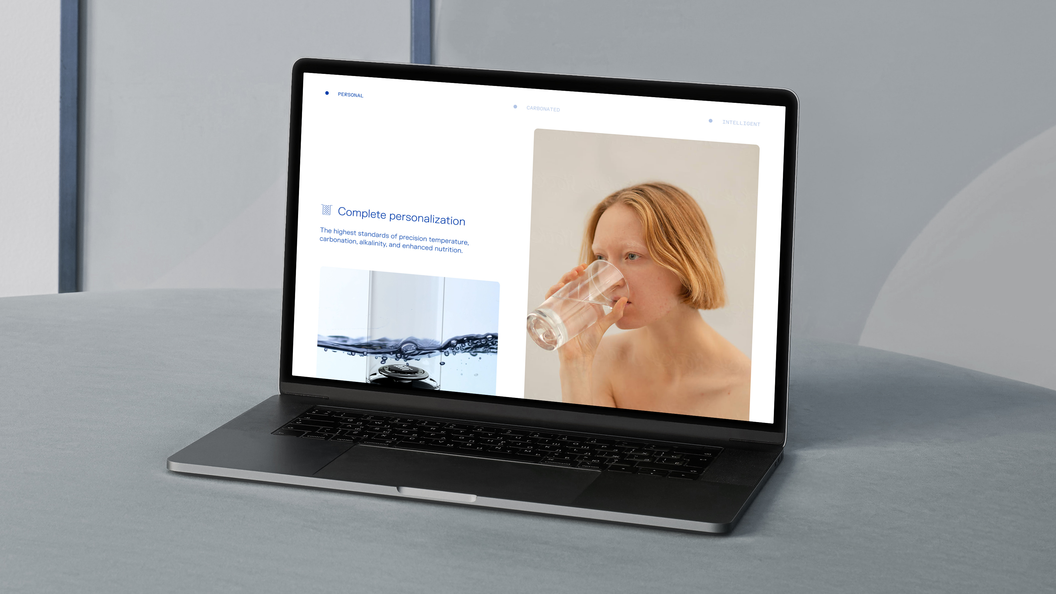
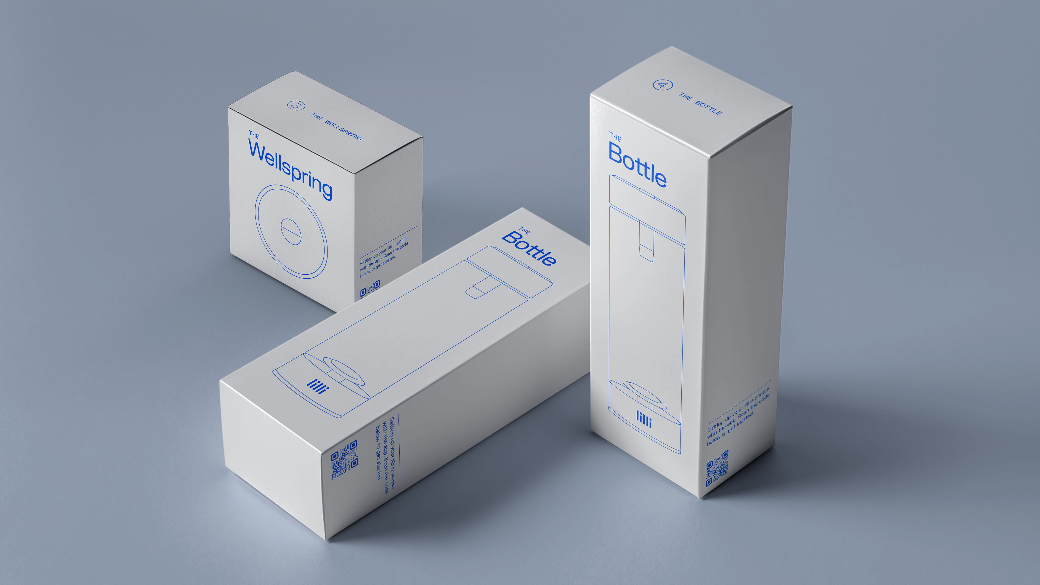
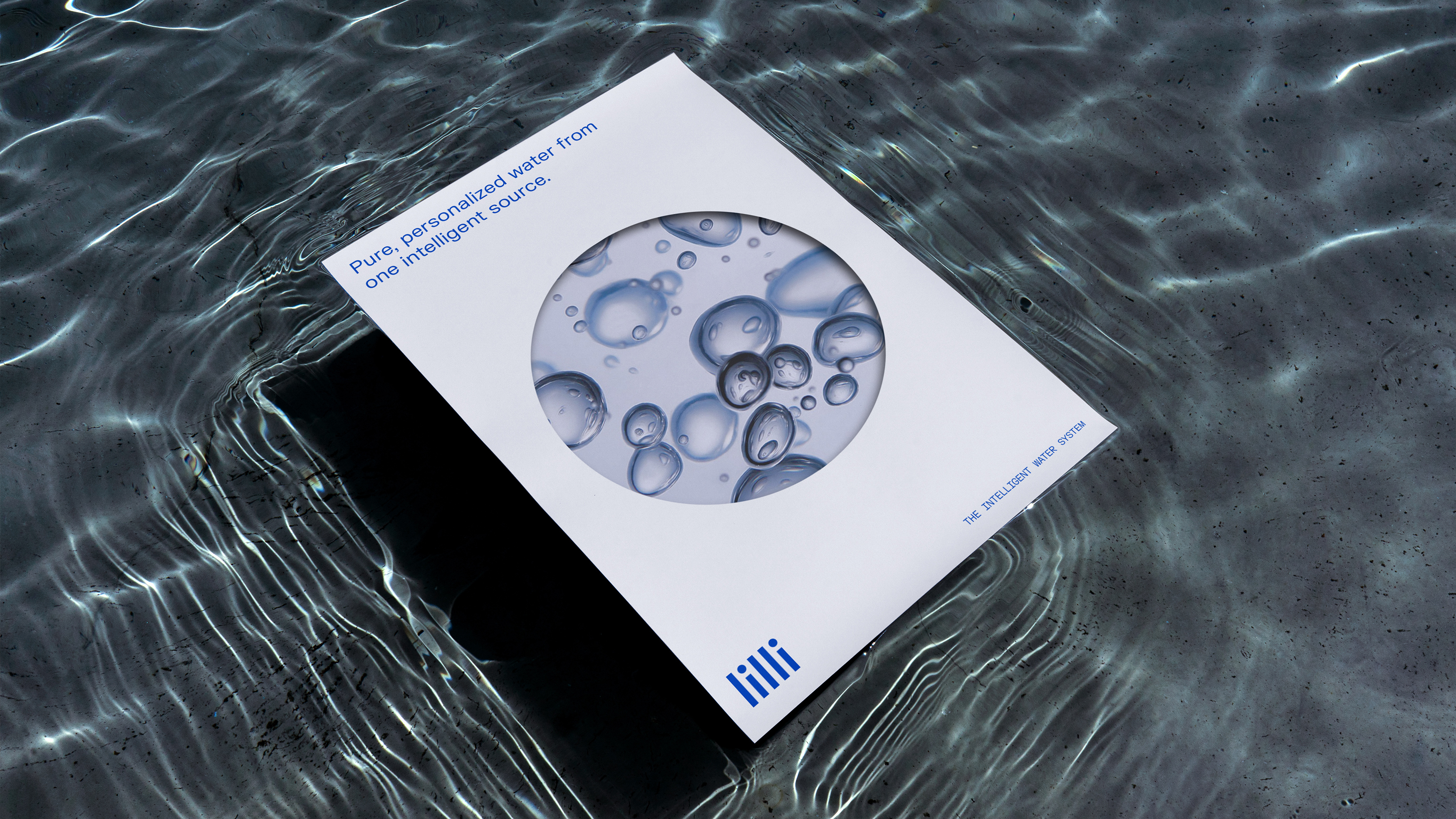
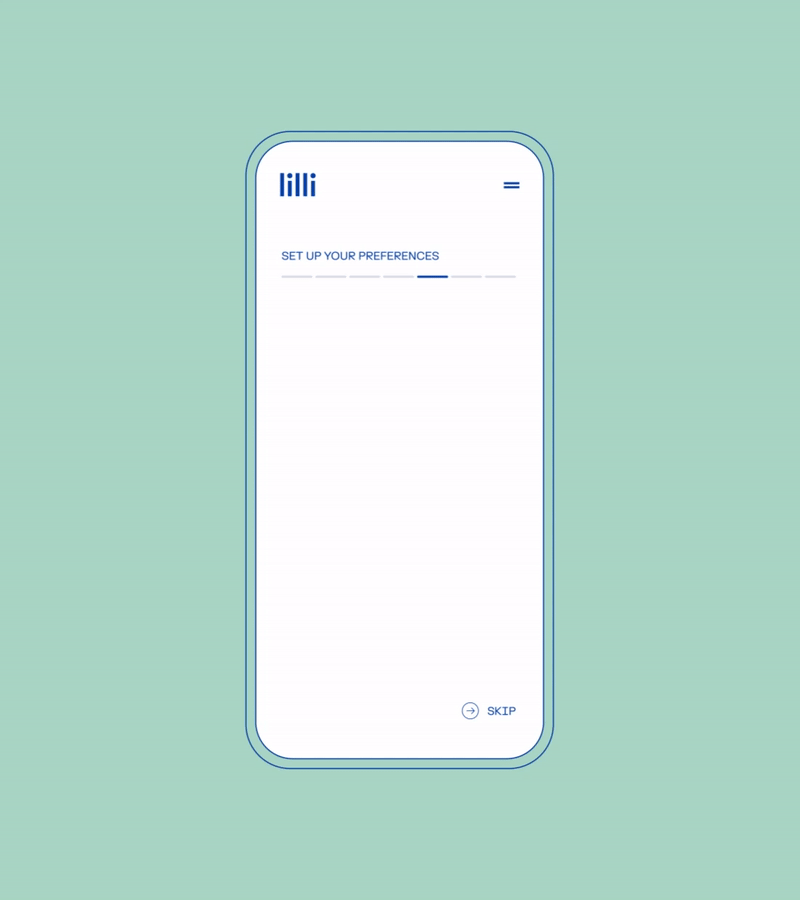
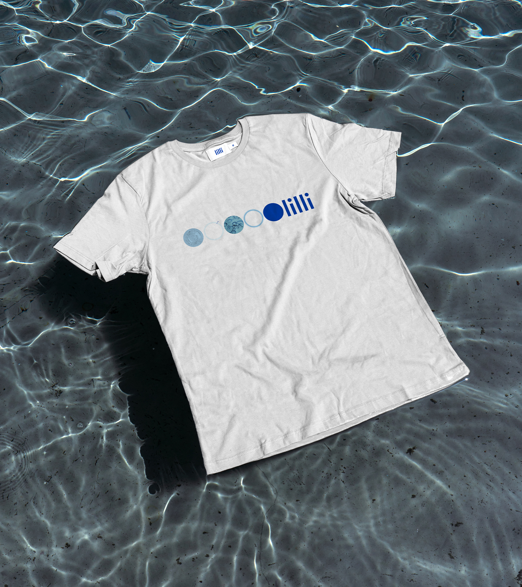
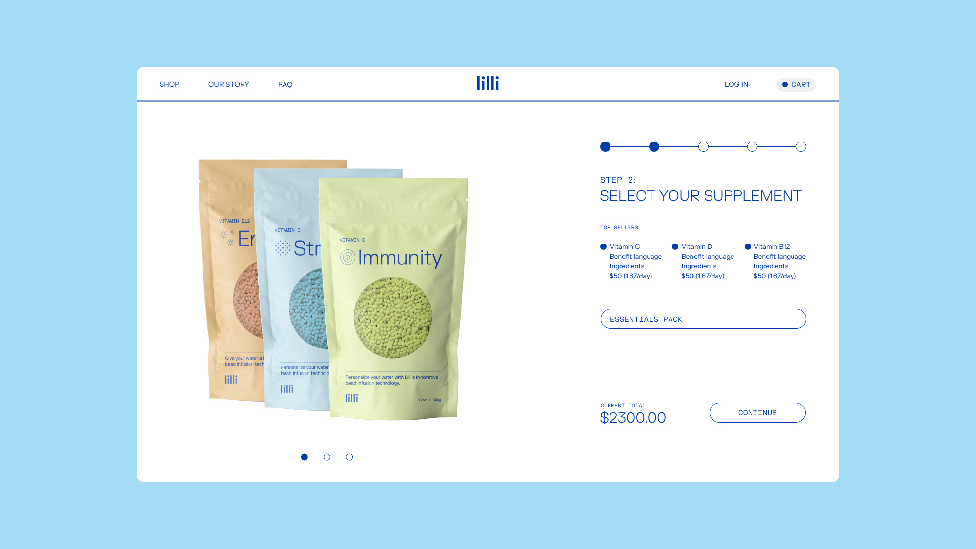
For over a decade, Lilli was on a journey to redefine a common household item—the faucet—and change our relationship with our most essential element—water. The Lilli brand is distilled to its essence: intelligence and customization. This cohesive brand identity includes a distinct symbol, color palette, typography system, and tone of voice that was influenced by the team’s research and precision in crafting their new system. A packaging system was developed that helps walk-through installation and troubleshooting, as well as a UI experience that encompasses personalized data & metrics.


Celery Man
Coming soon
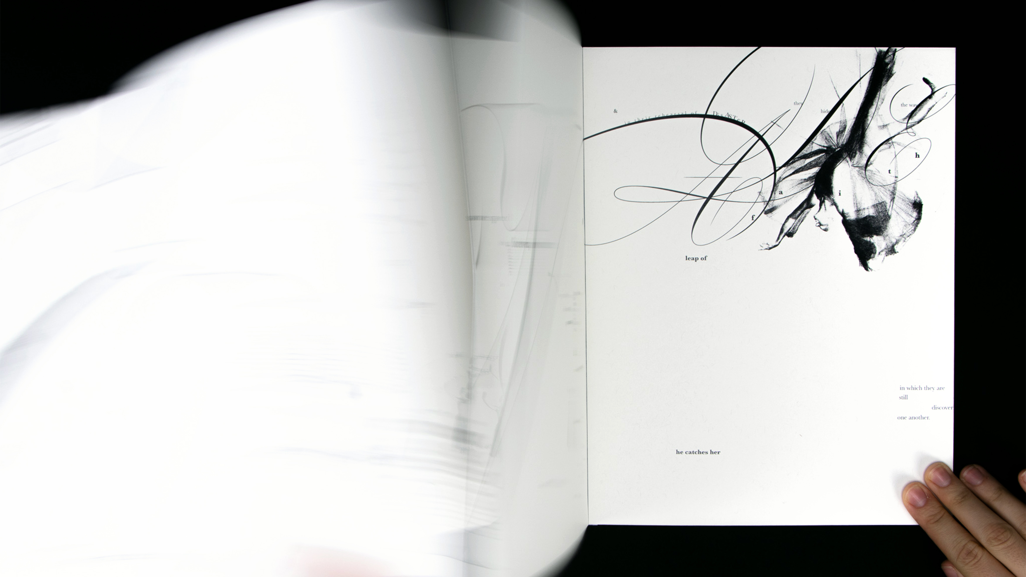
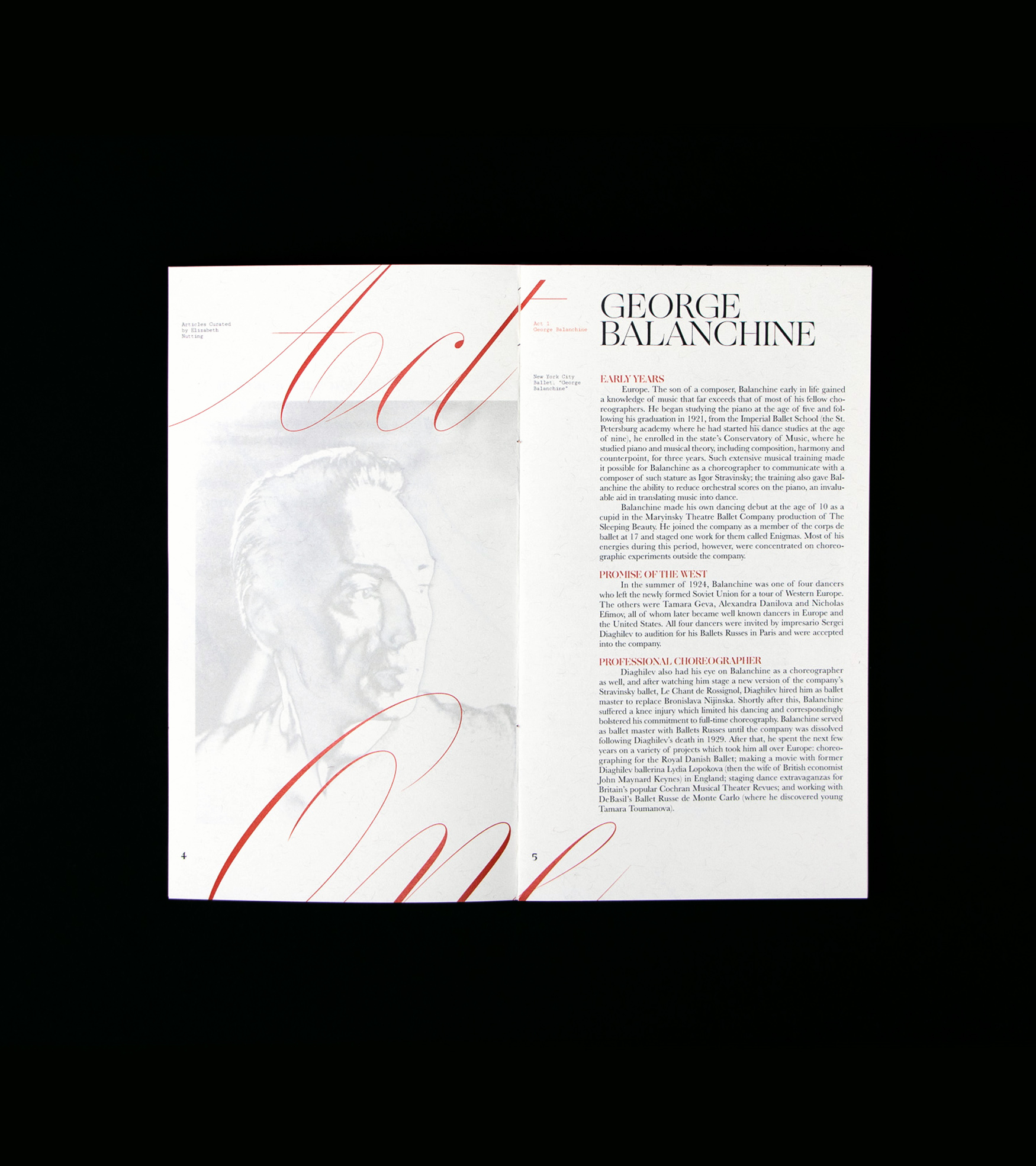
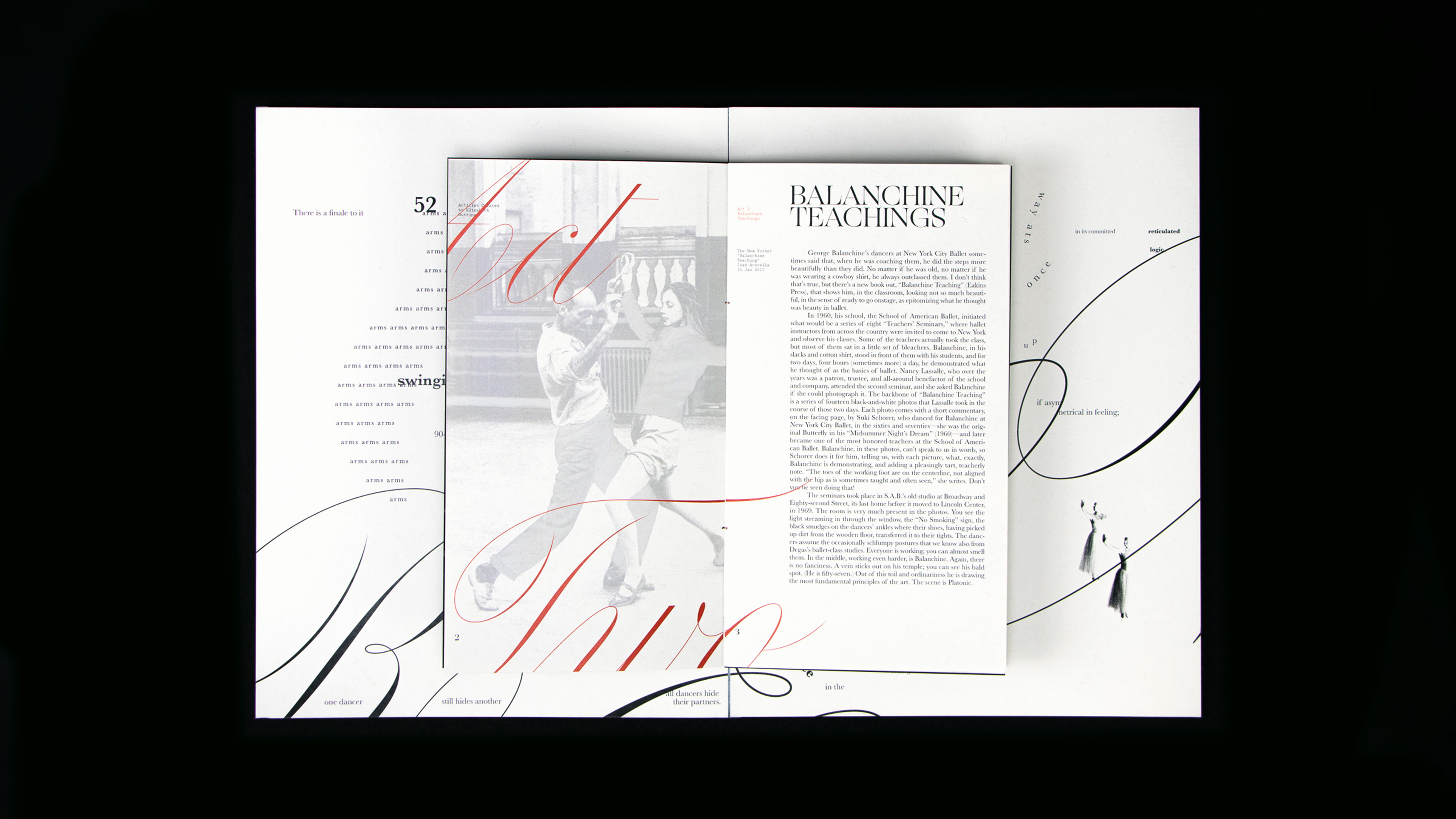
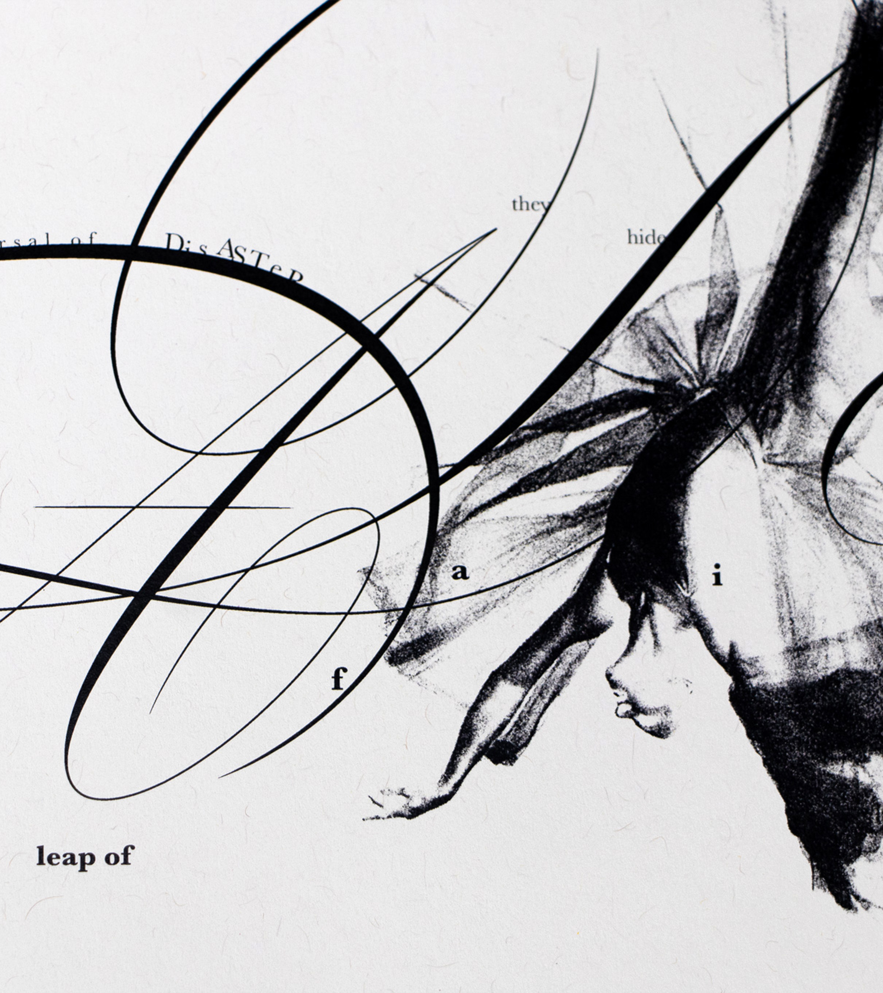
Poets of Gesture
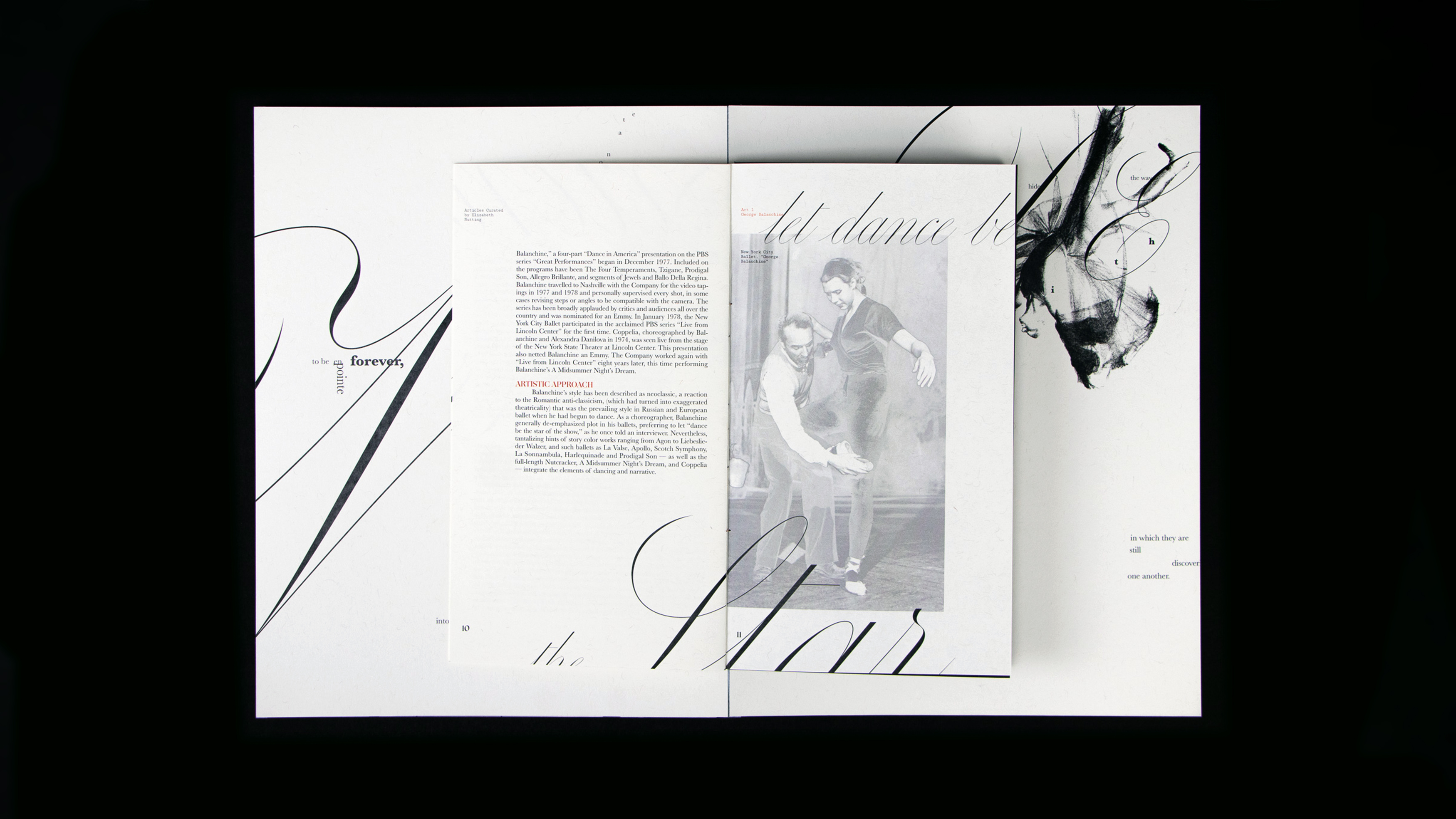
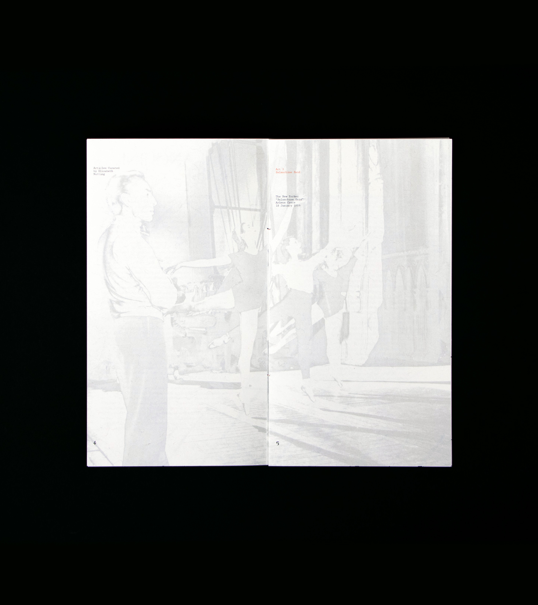
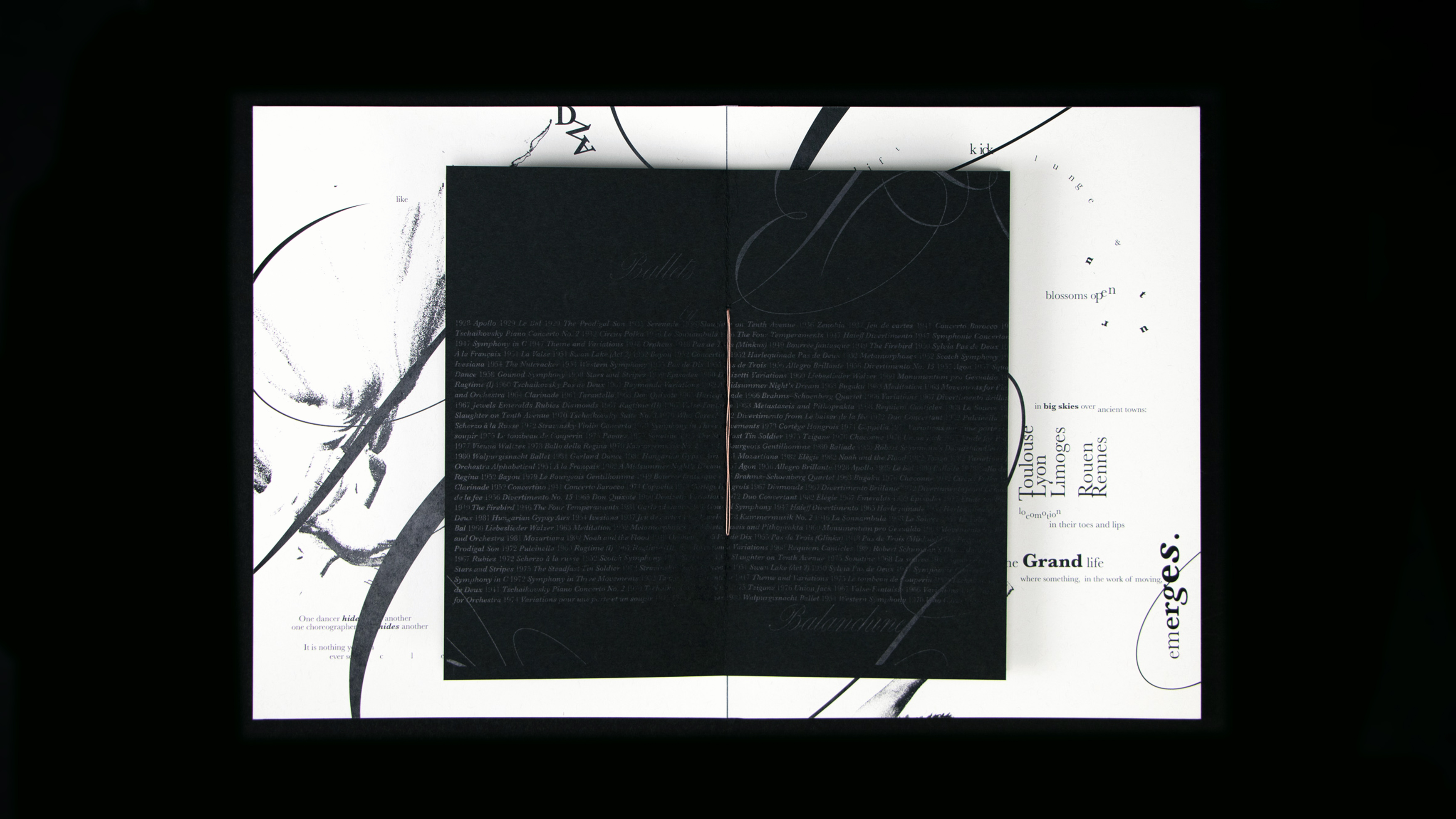
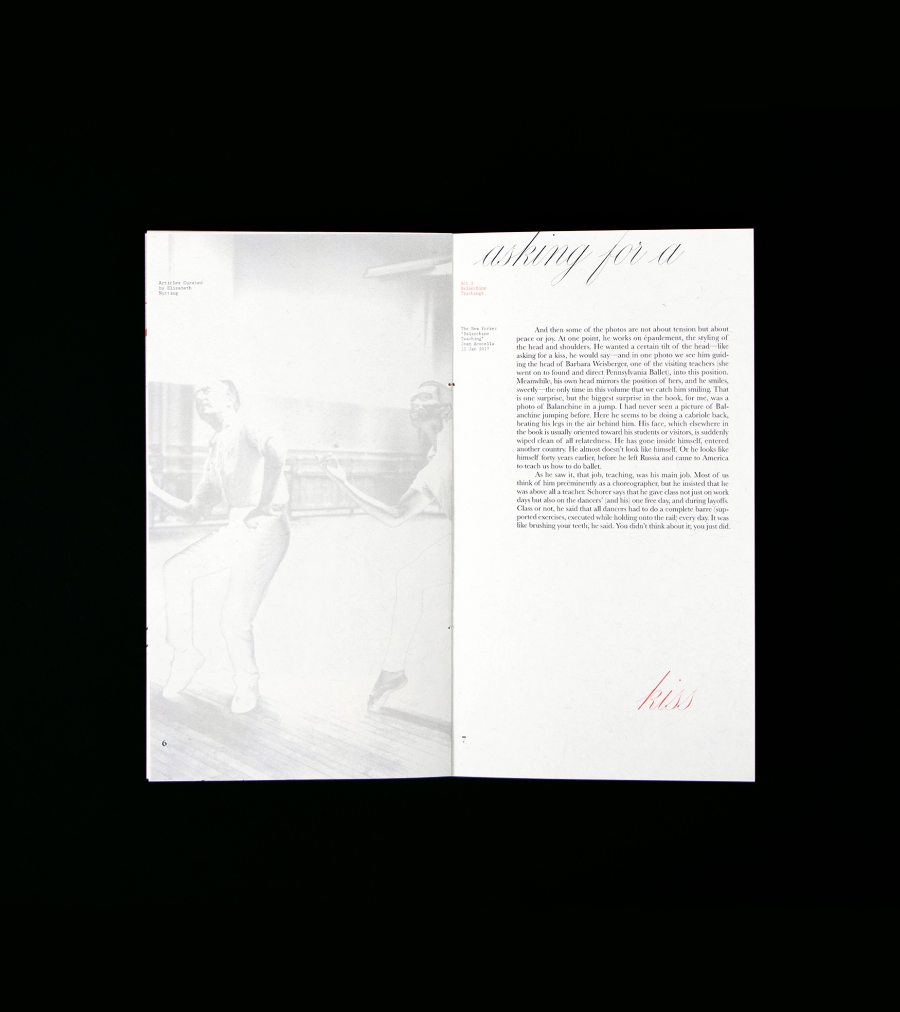
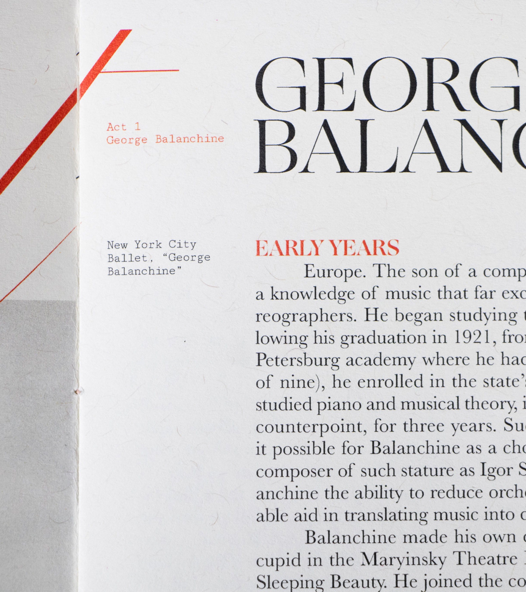
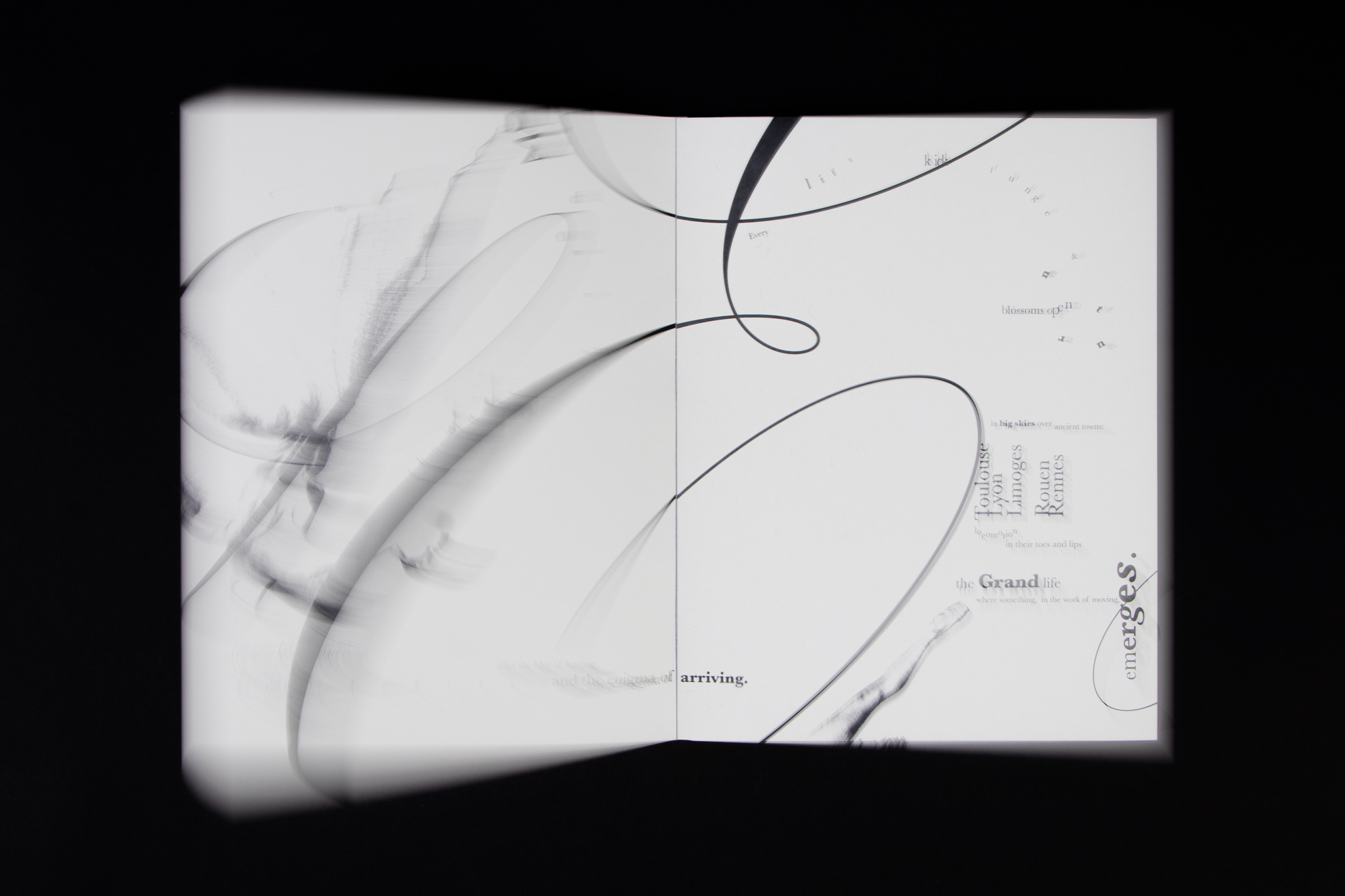
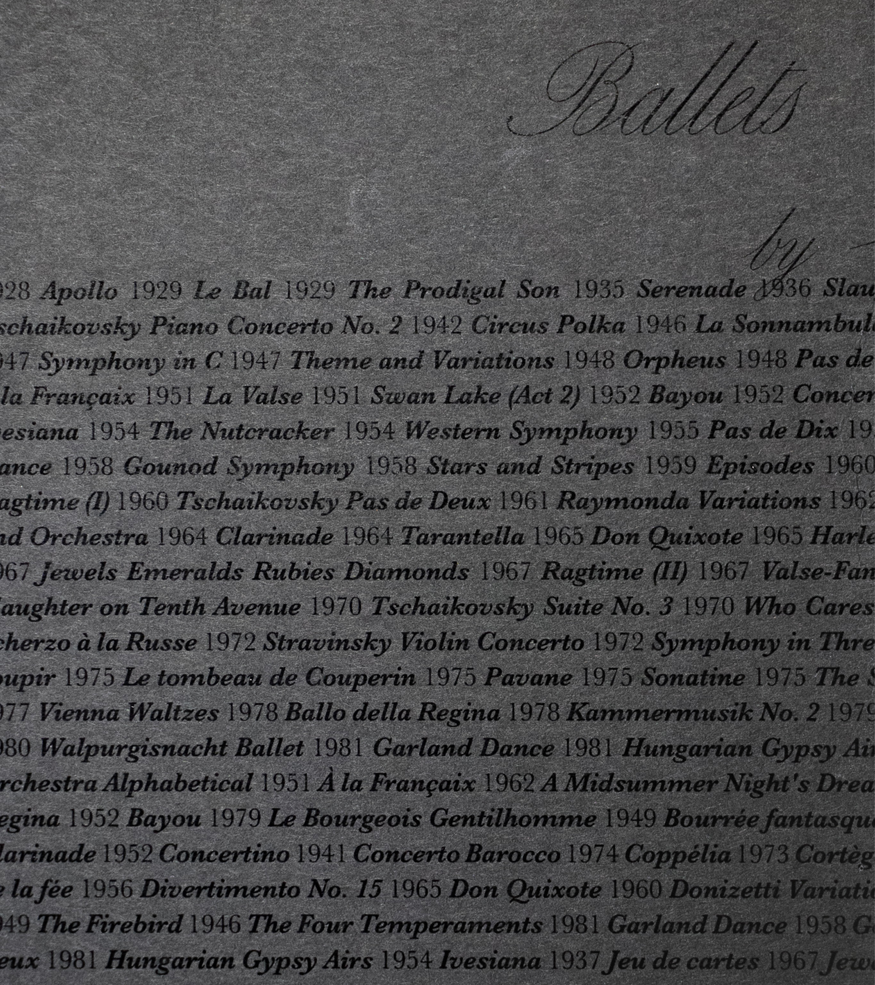
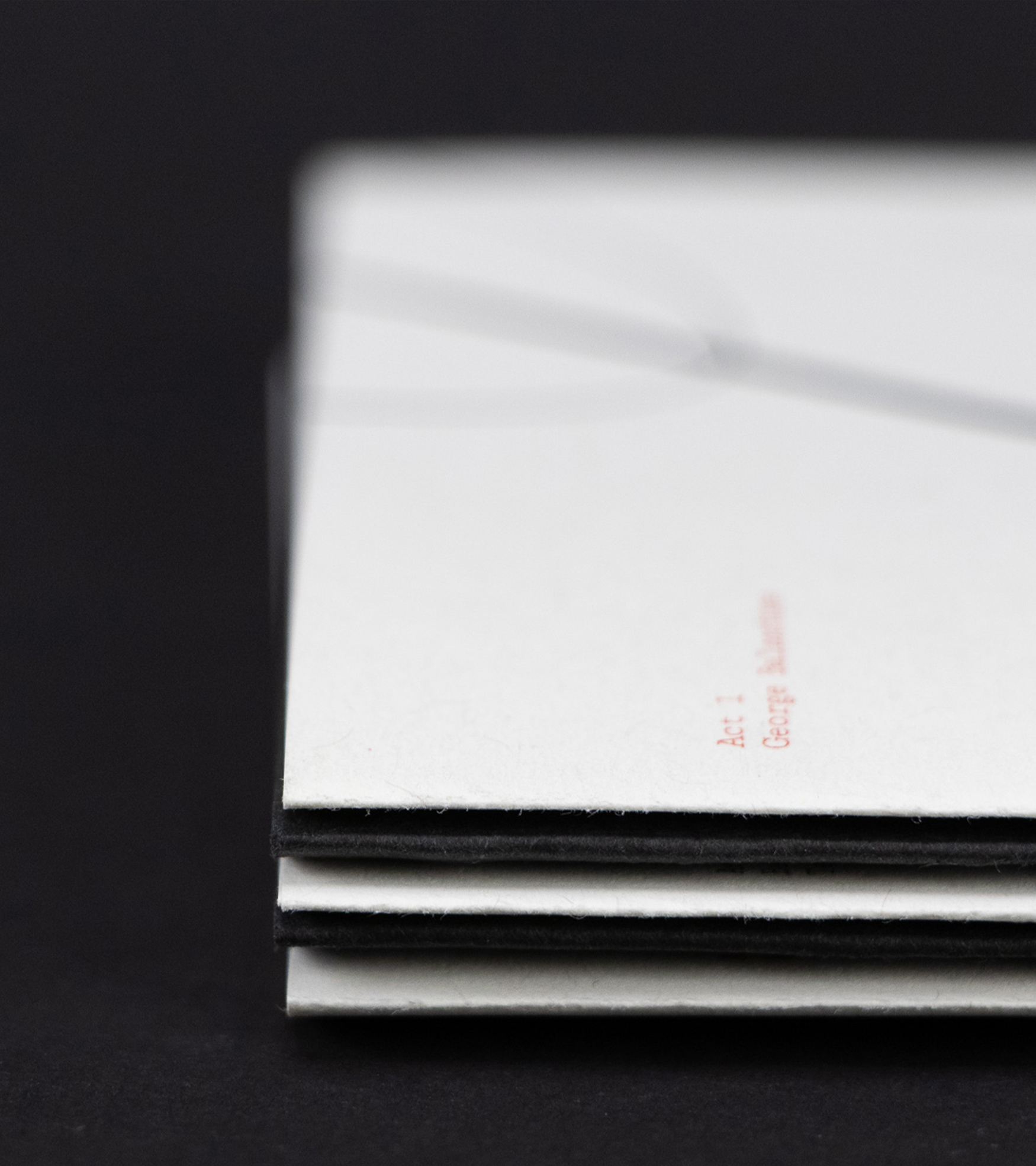
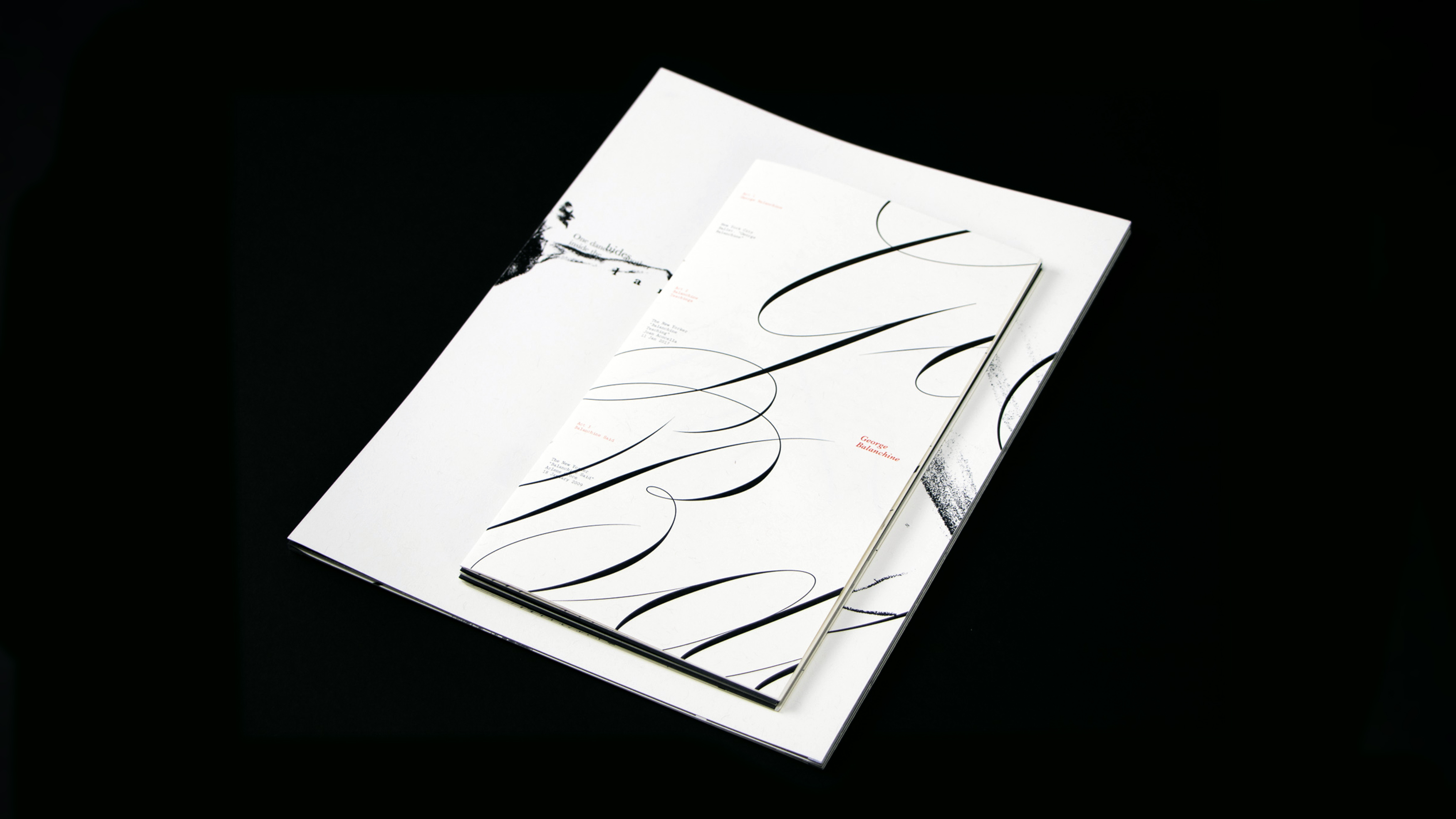
This publication unpacks the life & legacy of ballet master George Balanchine as a delicate, gestural experience. The primary document, carefully stitched together like ribbon is to pointe shoes, stages his life, teachings, and utterances throughout the pages. The secondary document, an accordion book, was designed through the lens of a choreographer, prioritizing space, dynamics, and nuance. In order to view all the pages, the reader has to make large, gestural movements which enhances their sensory experience. The two documents dance with each other and the reader, paying homage Balanchine’s legacy.

Umbo


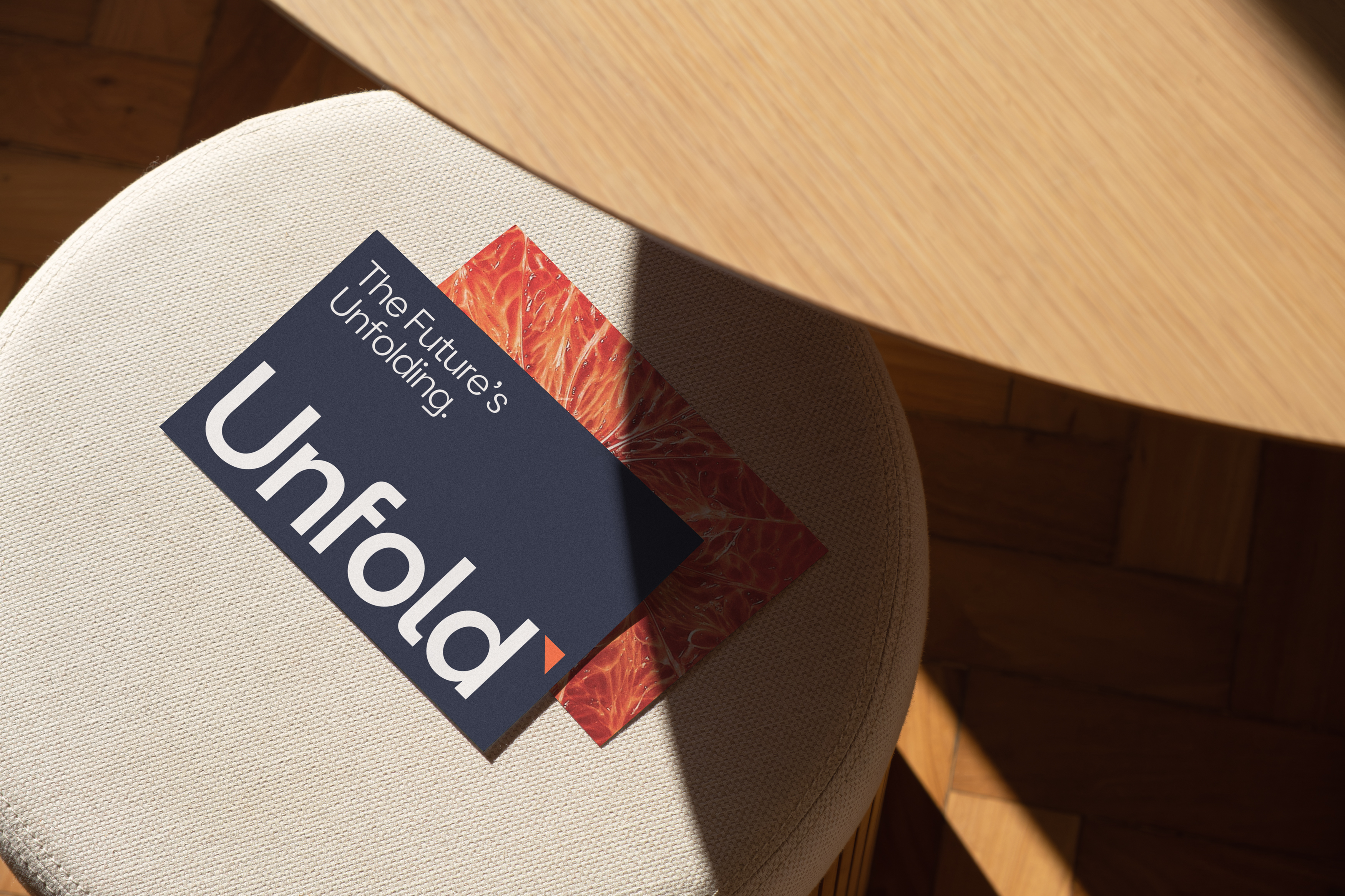
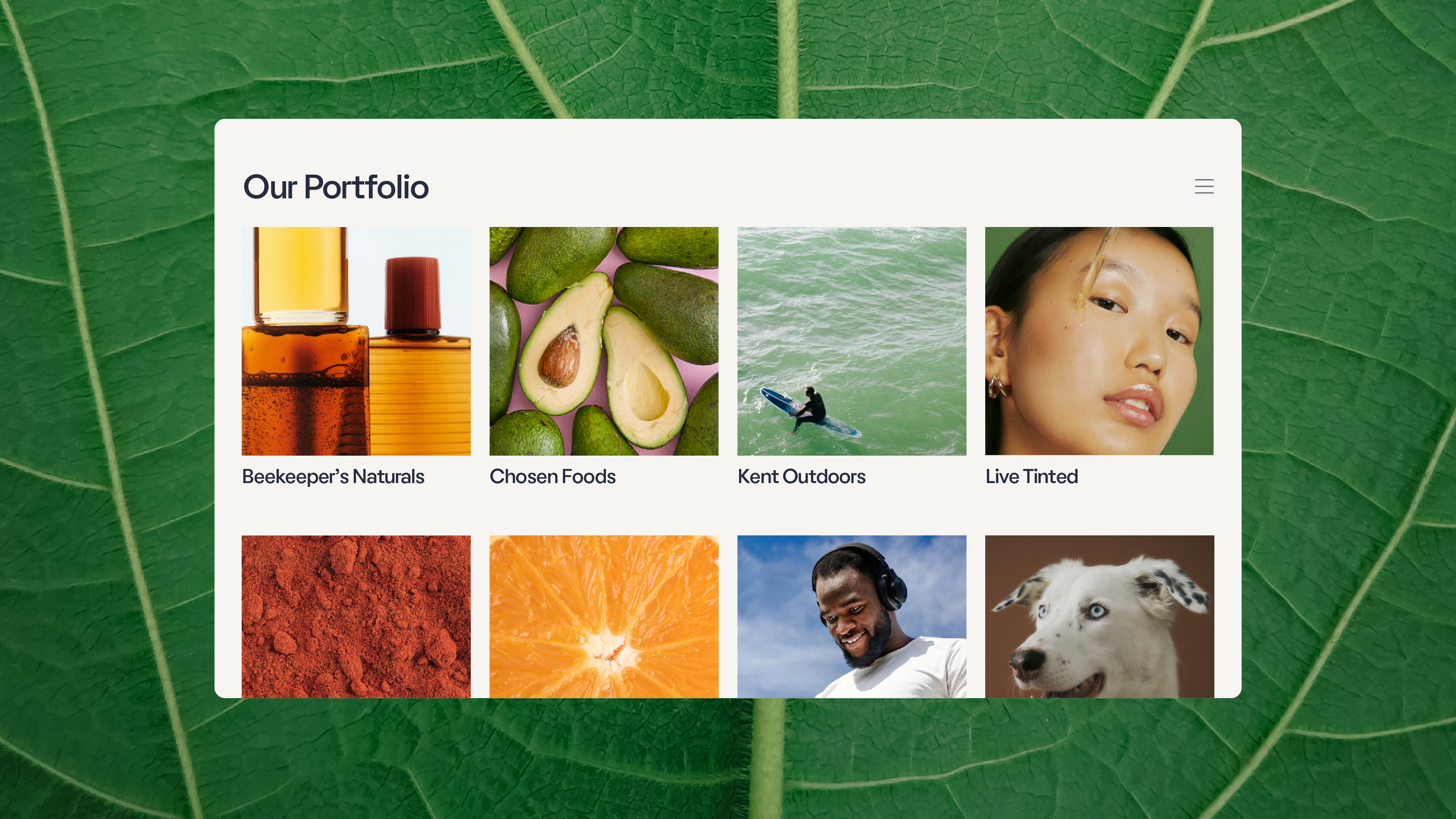
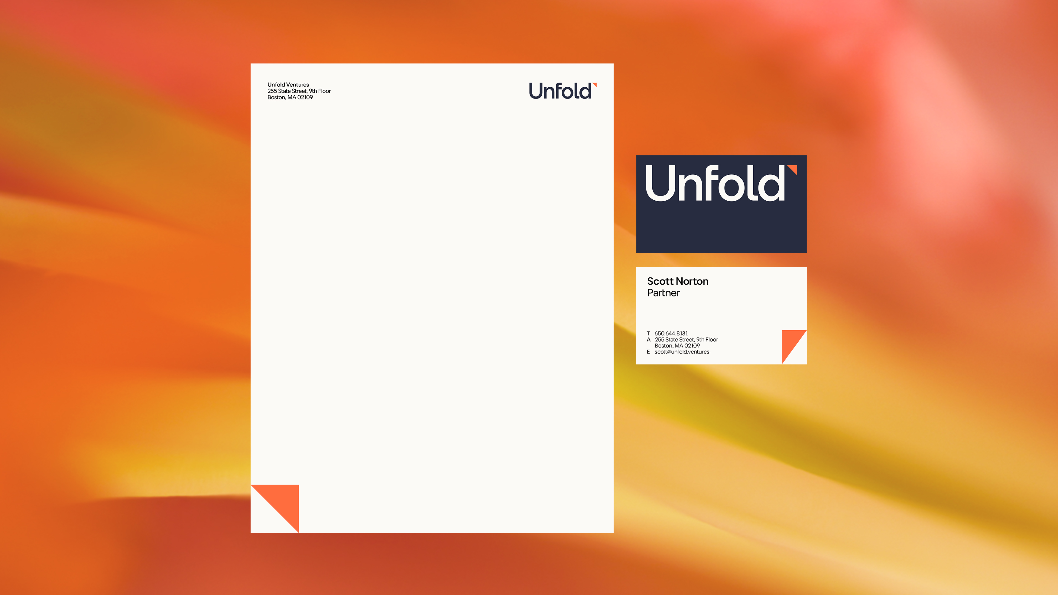
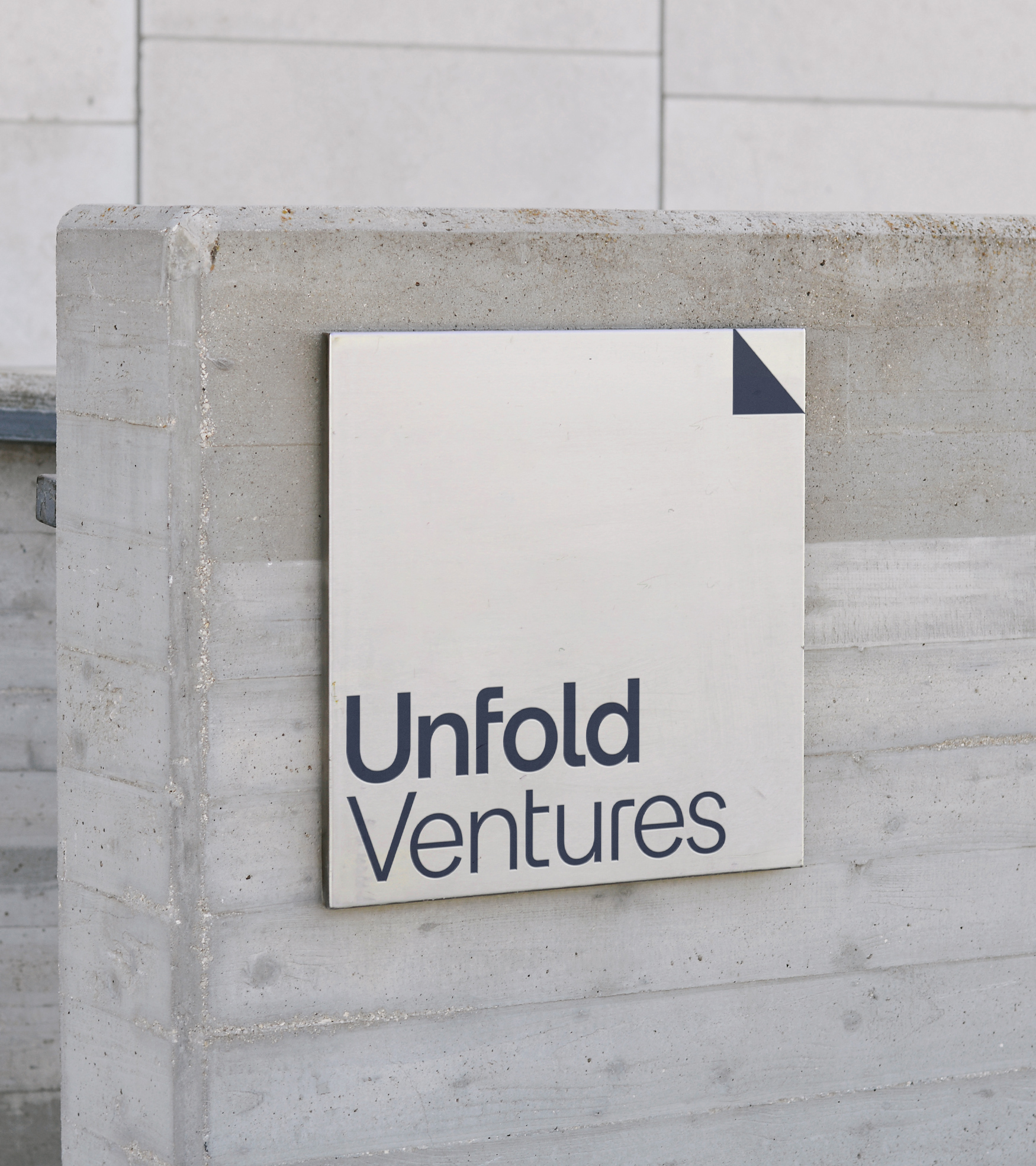
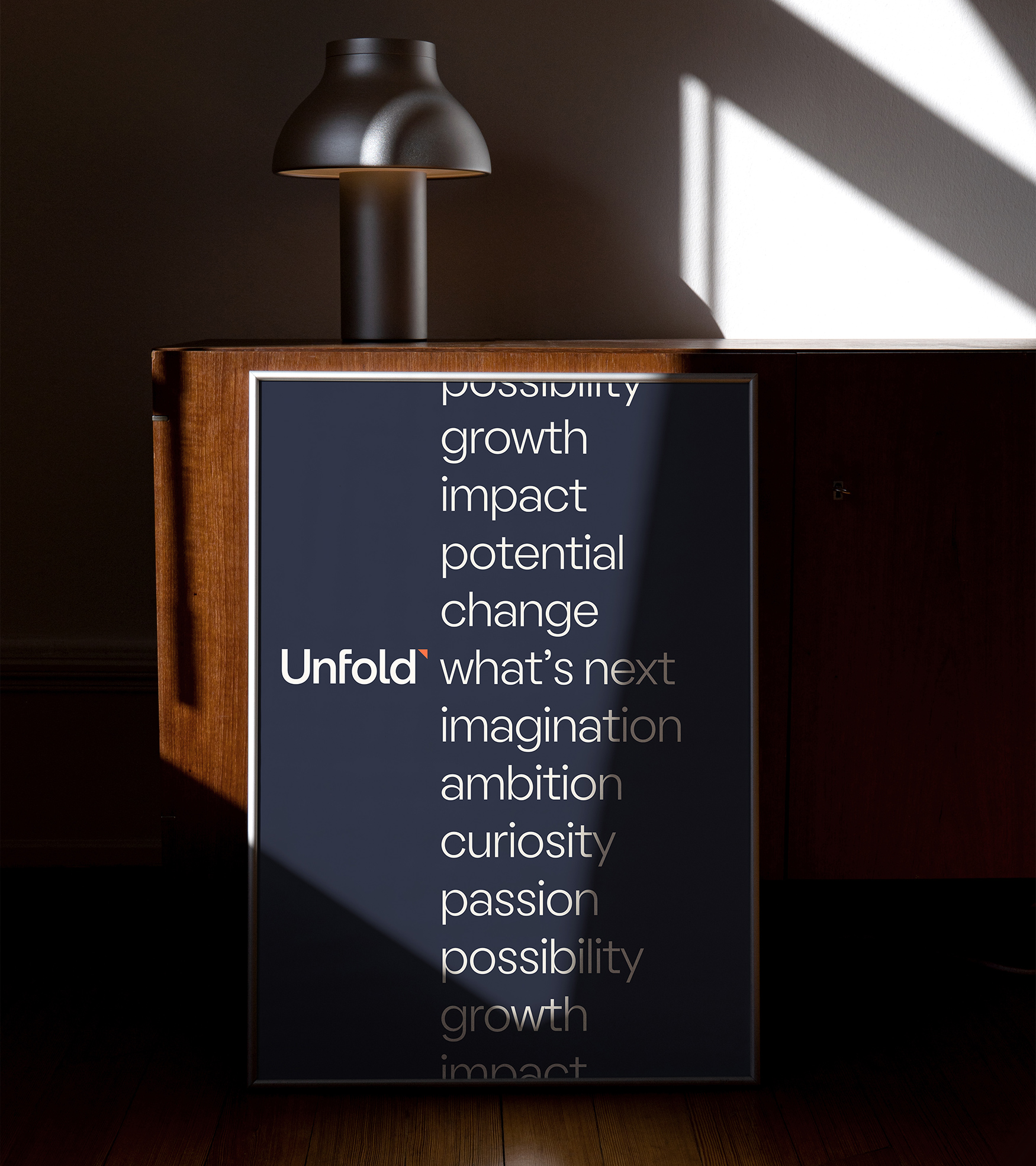
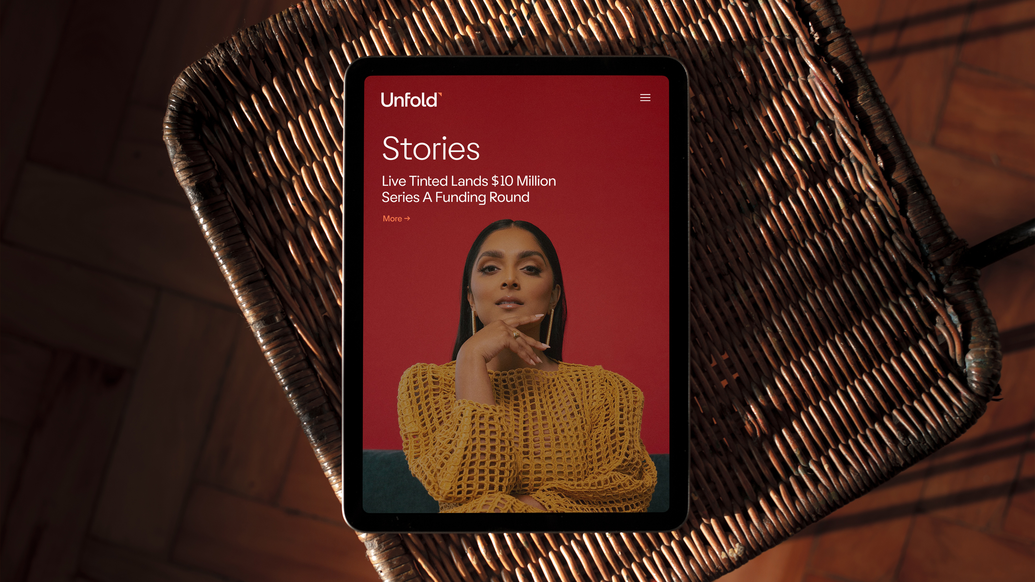
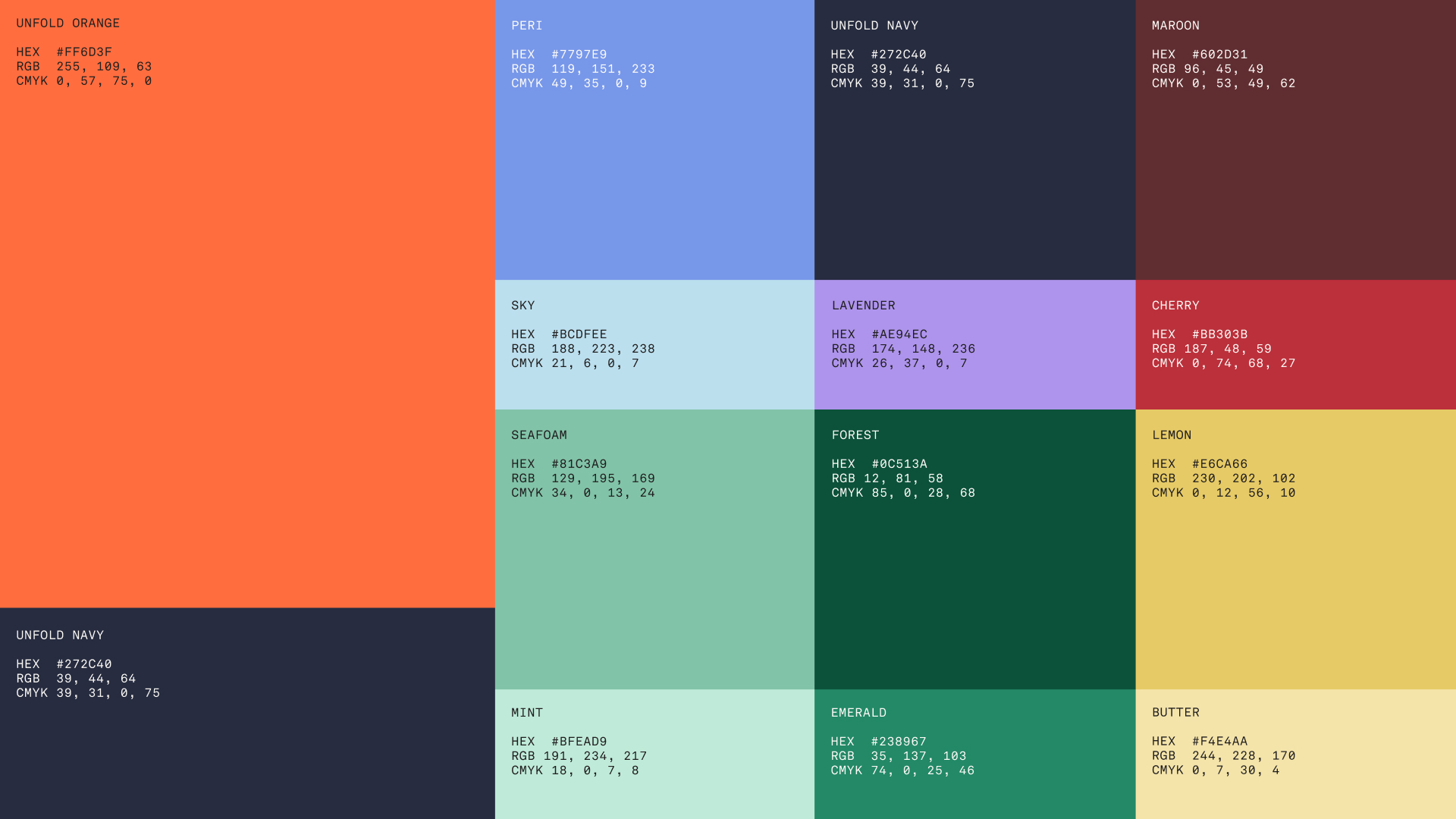
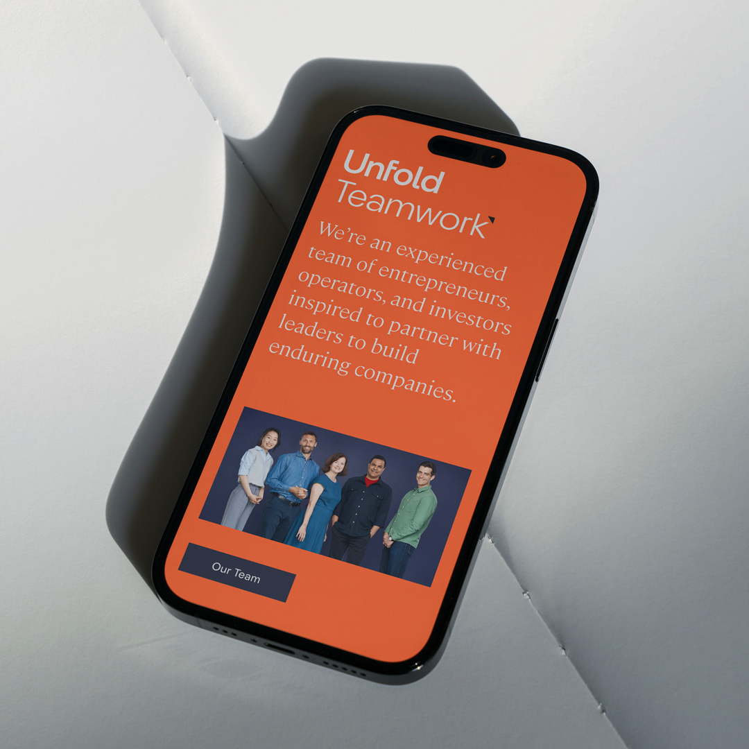
Unfold
Unfold, a new consumer-goods focused venture fund backed by Fidelity, was looking to create a brand that highlighted their approach to investing in diverse companies. The identity takes a visual cue from the company name with a page-fold icon hugging a custom wordmark. The corner fold references the brand’s innovative spirit and simultaneously acts as a directional arrow signaling Unfold’s investment in the future. The dynamic and fresh identity takes shape through digital and print media.