Case Study:
Detroit Institute of Arts
︎︎︎BACK TO PROJECT
TEAM ROLES
Elizabeth Nutting - Research, Brand Strategy, Print, Merch
Thomas McElmeel︎︎︎ - Research, Brand Strategy, Interaction, Web
LaSean Marie Patton︎︎︎ - Research, Brand Strategy, Signage, Web
TEAM ROLES
Elizabeth Nutting - Research, Brand Strategy, Print, Merch
Thomas McElmeel︎︎︎ - Research, Brand Strategy, Interaction, Web
LaSean Marie Patton︎︎︎ - Research, Brand Strategy, Signage, Web
RESEARCH
To begin, we spent a day at the DIA documenting observations, looking at materials, colors, shapes, and how visitors interacted with the art and space. We wanted to begin from an objective place, not carrying any opinions or assumptions into the research. This allowed us to identify traits and characteristics that we used to develop a semantic differential, which was sent out to gather public perceptions of the DIA. A few keywords that stood out from our results included, “old, complex, conservative, timeless, exclusive, and serious.”

Although this was productive, we realized that those keyword findings were not representative of the more intangible, subjective qualities that the museum had. We decided to create a similar “differential” but instead of using words, we used images, objects, materials, and sounds. Participants were asked, “What does the DIA {feel, sound, look, smell} to you?”
Here are a few quotes from the process:
“You see the hat, and maybe aren’t sure it’s a hat, but then you look and discover.”
“You can never really identify and never really find, but part of the joy is looking for it.”
“It’s about what’s seen & unseen. What you see is just the tip of the iceberg.”
This gave us helpful insight into people’s visceral experiences at the museum, many of which were shared-experiences.


In addition, we created visitor personas to direct the rebrand to current and aspirational audiences, including a local college student, an interracial couple with a young daughter, and a senior suburban couple.

Finally, we researched various art museums, like the Nelson-Atkins Museum and The Art Institute of Chicago. We learned that these museums incorporated technology into different touch-points to help orient attendees in navigation. This became a direction that we wanted to push the DIA in as well.

BRAND STRATEGY
Following our research, we began word-smithing their existing essence and promise to idenitfy our main goal and objectives. We created three diagrams to help us visualize and explain the objectives.


Essence - A container for a broad range of artifacts that document human creativity
Promise - The DIA is a community where everyone is exposed to a broad range of wondrous creativity
Promise - The DIA is a community where everyone is exposed to a broad range of wondrous creativity
Goal - To create connections between people, art, culture, and places
Objectives - Create a wide range of museum experiences, connect viewers to the depth of information behind each piece, and reflect inclusivity of culture & shared human experiences.
Objectives - Create a wide range of museum experiences, connect viewers to the depth of information behind each piece, and reflect inclusivity of culture & shared human experiences.
PROCESS
We spent several weeks experimenting, sketching, projecting, cutting, and connecting, always returning to our goal & objectives to inform our making. These iterations explore the DIA as a neutral container that makes connections between art, culture, and experiences.
About halfway through the making process, we pursued a visual direction with a variable DIA word-mark that changed form depending on the amount of connections that were made. We were conceptually excited about this direction, but recieved a lot of feedback that it felt sharp and unfriendly. Since this didn’t align with our goal for the DIA, we went back to the drawing board.


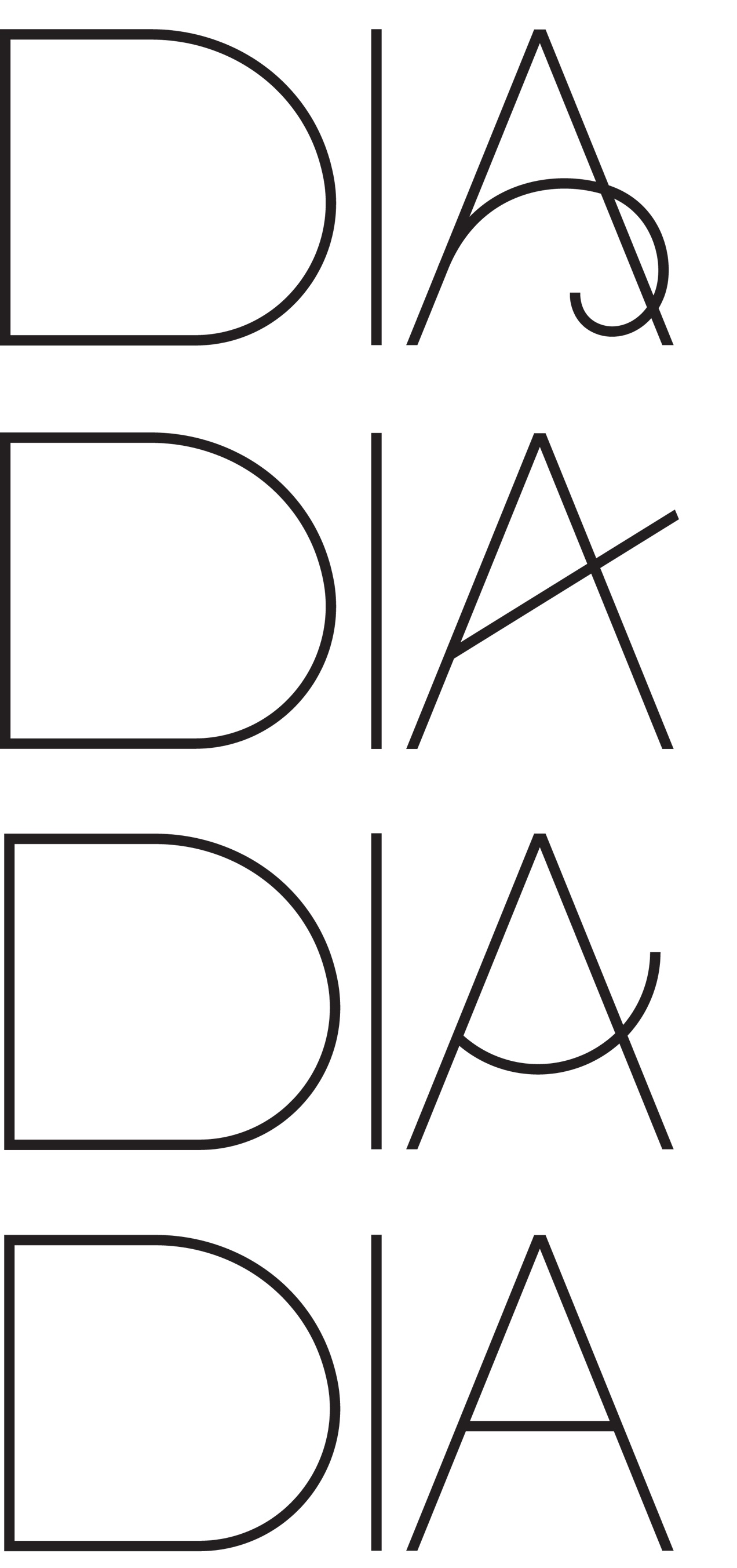
Keeping the idea of variability, we pulled four basic shapes from a golden ratio grid that could interchange as the crossbar of the A. This still reflected a broad range of connections and experiences but had a much more welcoming, sophisticated appearance.

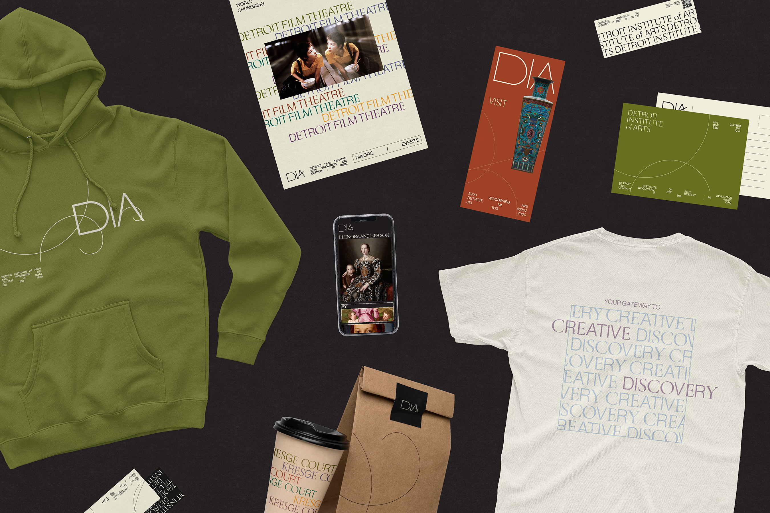
To modernize the classical roots of the DIA, we created a mixed type pairing with Neue Haas Grotesk & Garamond. The body text is treated with justification, creating the illusion of containers and tying back to our goal. For pattern and shape, we used repetition, the breaking of boxes or boundaries, and geometric lines pulled from the golden ratio grid. The color is warm, muted, and inviting, still reflecting the classy mood of the DIA. The colors are existing wall paint colors at the DIA that were adjusted a little, to feel rooted in something familiar but take on a new life. Lastly, the imagery and artwork we chose to use for applications reflects the true diversity and cultural range of the DIA’s collection.
︎︎︎BRAND GUIDELINES